

Supplement label font requirements are defined by FDA regulations under 21 CFR 101.36, setting minimum type sizes and formatting rules that determine whether your product can legally reach store shelves. These are not design preferences. They are enforceable standards, and getting them wrong triggers warning letters, product recalls, and lost distribution. This guide breaks down every font size threshold, formatting rule, and compliance risk you need to know before your next label goes to print.
Supplement label font requirements explained: FDA size rules by package
The FDA sets minimum font sizes for Supplement Facts panels based on the total surface area of your label. The size of your package determines which threshold applies, and there is no flexibility once you fall into a category.
Here is how the tiers break down:
| Package Label Area | Minimum Body Text Size | Notes |
|---|---|---|
| Standard (over 40 sq in) | 8 point | Applies to all body text in the panel |
| Intermediate (12–40 sq in) | 6 point | Conditional; must still be legible |
| Small (under 12 sq in) | 4.5 point | Absolute minimum; limited exceptions |
FDA regulations require all body text in Supplement Facts panels on standard packaging to be no smaller than 8 point. That 8-point floor is the number most manufacturers know, but it is the intermediate and small-package rules where violations cluster. For smaller packages under 12 square inches, the floor drops to 4.5 point, but that does not mean 4.5-point text is readable or safe from scrutiny.

Column headings and footnotes get their own allowance. Column headings and footnotes may be as small as 6 point on certain smaller and intermediate-sized packages. This matters because designers often apply the body text minimum uniformly and either waste space or inadvertently violate the column-heading rule by going too small without realizing a separate standard applies.
Pro Tip: Measure your label's total printable surface area before you finalize any font sizes. A label that looks standard on screen may fall into the intermediate category once you account for bleed, margins, and non-printable zones.
One detail that catches manufacturers off guard: these minimums apply to the text as it appears on the finished, printed label. Not in your design file. Not on your monitor at 100% zoom. On the physical label after printing and application.
How font style and contrast affect compliance beyond size
Meeting the minimum point size is necessary but not sufficient. Legibility depends on more than font size. Font type and contrast carry equal regulatory weight, and the FDA is explicit about both.
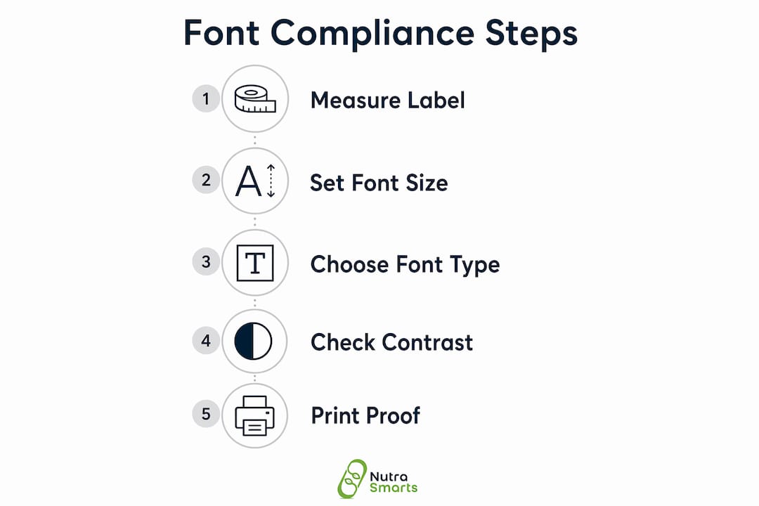
The FDA mandates clear, sans-serif fonts for Supplement Facts panels. Fonts like Arial and Helvetica are the industry standard for a reason. Decorative, script, or condensed typefaces may technically hit 8 points but still fail the legibility test because their letterforms are harder to read at small sizes. The FDA's position is that aesthetically styled fonts or low-contrast colors that impair readability cause non-compliance even when the point size meets the minimum.
Contrast is the other half of the equation. The FDA requires black text or single-color text on a white or neutral background for the Supplement Facts panel. Printing dark gray text on a light gray background may pass a visual check in your office but fail under regulatory review. The standard is functional contrast, not aesthetic contrast.
Formatting rules go further than font choice:
- Bold the "Supplement Facts" title. This is mandatory, not optional.
- Maintain exact visual hierarchy. The FDA prescribes specific font weights for titles, column headings, and body text under 21 CFR 101.36.
- Use specified line weights for box borders. The hairline box surrounding the panel has a required weight. Thinner lines can disappear in printing and create a compliance issue.
- Never rearrange the panel layout for aesthetics. Strict visual hierarchy is required under 21 CFR 101.36. Aesthetic rearrangement is prohibited.
Pro Tip: Run a grayscale print proof of your label before final approval. If the Supplement Facts panel text becomes difficult to read in grayscale, your contrast is insufficient for compliance.
The distinction between Supplement Facts and Nutrition Facts panels is also a formatting compliance issue. Supplement Facts panels are legally distinct from Nutrition Facts panels used for conventional foods. Using Nutrition Facts formatting on a dietary supplement is a direct violation, not a minor technicality. The two panels have different required elements, different ordering rules, and different font hierarchy standards.
What are the most common font-related compliance pitfalls?
Font compliance failures rarely happen because a manufacturer ignored the rules. They happen because the rules interact with production realities in ways that are easy to miss. Here are the most consequential pitfalls, in order of how often they trigger FDA action.
-
Print scaling reduces font size below the legal minimum. Scaling label designs during printing can reduce font size below the legal minimum, making the entire production run non-compliant. A design built at 4 inches wide imposed at 3.8 inches during press setup shrinks every font proportionally. An 8-point font becomes 7.6 points. That is a violation across every unit in the run.
-
Using Nutrition Facts formatting instead of Supplement Facts. Using Nutrition Facts formatting on dietary supplements is a common compliance violation. The panels look similar to non-specialists, which is exactly why this error persists. The Supplement Facts panel has distinct required elements under 21 CFR 101.36 that Nutrition Facts panels do not.
-
Structure-function claim disclaimers in inadequate font sizes. Structure-function claims require an FDA disclaimer printed in legible type proportional to the label panel size. Missing or undersized disclaimers are among the top triggers for FDA warning letters. The disclaimer must also be printed in boldface type and visually connected to the claim it accompanies.
-
Omitting the domestic adverse event reporting contact. Many manufacturers omit required domestic adverse event reporting contact details on labels. This omission, combined with font size and format errors, frequently triggers FDA warning letters during audits. The contact information must appear in a legible font size, not buried in 4-point text at the bottom of a panel.
"Compliance failures in supplement labeling are rarely about ignorance of the rules. They are about the gap between the design file and the finished product. That gap is where font violations live."
For a broader look at labeling errors that reach the market, the non-compliant label examples documented by Nutrasmarts show how these mistakes appear on real products.
How to design compliant supplement labels with font requirements in mind
Designing a compliant label is a sequencing problem as much as a design problem. The order in which you place elements determines whether mandatory information survives the space constraints of your packaging.
Start with mandatory elements at their required font sizes. Mandatory label information like net quantity and manufacturer details must meet minimum font sizes and must never be compromised for voluntary content. This means your Supplement Facts panel, net quantity statement, manufacturer name and address, and structure-function claim disclaimers get placed first at compliant sizes. Everything else fills the remaining space.
Here is a comparison of how compliant and non-compliant design workflows differ:
| Design Step | Compliant Workflow | Non-Compliant Workflow |
|---|---|---|
| Starting point | Mandatory elements at required sizes | Brand graphics and marketing copy first |
| Space conflicts | Remove voluntary content | Shrink mandatory text to fit |
| Print proof check | Verify font sizes against press dimensions | Visual check only on screen |
| Panel format | Supplement Facts under 21 CFR 101.36 | Adapted from Nutrition Facts template |
| Disclaimer placement | Boldface, adjacent to claim, legible size | Footer, small font, separate from claim |
When space is tight, voluntary label content can be reduced or removed to maintain mandatory element font sizes. This is not a compromise. It is the correct regulatory priority. A label with fewer marketing claims and full compliance is always preferable to a label with strong branding and an FDA warning letter.
The final PDF proof must be checked against the intended press sheet dimensions, not just the design file dimensions. The final label PDF proof must be verified against press sheet imposition dimensions to confirm font sizes remain above regulatory thresholds after any scaling. Build this check into your pre-press approval process as a non-negotiable step.
Pro Tip: Use the Nutrasmarts FDA-compliant label creator to generate your Supplement Facts panel with correct font sizes and formatting built in. Starting from a compliant template eliminates the most common formatting errors before design begins.
For manufacturers who want a full picture of what the FDA checks during a label review, the 2026 supplement label checklist from Nutrasmarts covers every required element with current standards.
Key takeaways
Supplement label font compliance is determined by package size, font type, contrast, and formatting hierarchy, not point size alone.
| Point | Details |
|---|---|
| Font size depends on package area | Standard labels require 8-point minimum; small packages under 12 sq in allow 4.5-point minimum. |
| Style and contrast are enforceable | Sans-serif fonts like Arial and black text on neutral backgrounds are required, not recommended. |
| Print scaling creates violations | A design scaled down even slightly at press can push fonts below the legal minimum across the full run. |
| Mandatory elements come first | Remove voluntary content before reducing mandatory text size when space is limited. |
| Disclaimer font size triggers warnings | Structure-function claim disclaimers must be boldface, legible, and adjacent to the claim they reference. |
Where most manufacturers get this wrong
After working with supplement labeling standards across hundreds of products, the pattern is clear: most font compliance failures are not caused by designers who ignored the FDA rules. They are caused by designers who applied the rules to the wrong version of the label.
The design file is not the label. The press sheet is the label. That distinction sounds obvious, but it is the source of the majority of font violations we see. A manufacturer approves a beautiful, compliant design file, sends it to the printer, and the printer imposes it at a slightly different size to fit the press sheet. Nobody checks the output dimensions against the font size minimums. The entire run ships with 7.4-point body text instead of 8-point, and the product is technically non-compliant from the first unit.
The second pattern is the belief that creative design and regulatory compliance are in tension. They are not. The FDA's formatting rules for Supplement Facts panels are specific, but they leave significant room for brand expression in every other part of the label. The mistake is treating the Supplement Facts panel as a design canvas. It is not. It is a regulated document. Once manufacturers accept that distinction, compliance becomes straightforward and the creative work gets focused where it belongs.
My advice: build your compliance check into the pre-press step, not the design review step. By the time a label reaches design review, the layout decisions are already made and changes are expensive. A pre-press font size audit against actual press dimensions costs almost nothing and catches the errors that matter most.
— Nutrasmarts
Build compliant labels faster with Nutrasmarts
Nutrasmarts built the Supplement Facts Label Creator specifically to remove the guesswork from font size and formatting compliance. The tool generates FDA-compliant Supplement Facts panels with correct font sizes, required formatting hierarchy, and proper panel structure built in from the start. You do not need to cross-reference 21 CFR 101.36 manually or audit a design file against regulatory thresholds.

Beyond label generation, Nutrasmarts provides access to a database of over 800 ingredients, each linked to peer-reviewed research, so your label claims are grounded in clinical evidence. For manufacturers who want to verify their supplement ingredients before committing to label copy, the database connects ingredient listings directly to the studies that support them. Accurate labels start with accurate ingredient data.
FAQ
What is the minimum font size for a supplement label?
The minimum font size for body text in a standard Supplement Facts panel is 8 point. Smaller packages under 12 square inches may use 4.5-point text, and intermediate packages between 12 and 40 square inches have a conditional minimum of 6 point.
Can i use any font style on a supplement label?
No. The FDA requires clear, sans-serif fonts such as Arial or Helvetica for Supplement Facts panels. Decorative or script fonts that impair readability cause non-compliance even when the point size meets the minimum threshold.
What happens if my label font is too small after printing?
The entire production run is considered non-compliant. Even slight scaling during printing can reduce font sizes below the legal minimum, which means every unit in that run violates FDA labeling standards and is subject to recall or warning action.
Do structure-function claim disclaimers have font requirements?
Yes. Structure-function claim disclaimers must appear in boldface type at a legible size proportional to the label panel. They must also be visually connected to the claim they reference. Missing or undersized disclaimers are a top trigger for FDA warning letters.
What is the difference between supplement facts and nutrition facts panels?
Supplement Facts panels are legally distinct from Nutrition Facts panels under 21 CFR 101.36. They have different required elements, different formatting rules, and different font hierarchy standards. Using a Nutrition Facts format on a dietary supplement is a direct compliance violation.